How India (would have) voted?
In this exploratory exercise, the biggest challenge was to find a common level at which demographic data (through the census) and granular election data for India is available.
Methodology
To my luck, the Delimitation Act, 2002 mandates that each state legislative assembly district (Vidhan Sabha seat) cannot cross District lines so I was able to gather election data for the 2019 Lok Sabha (General Election). I aggregated the data for each assembly segment to the district level and then cleaned the dataset, assigned parties alliances for macro analysis & finally prepared a composite district level dataset with census data and alliance level voting data which can be found here on my Github.
Then I used (a couple but finally decided on) the k Nearest Neighbour model to use demographic data such as religious, caste, education and urbanity data (total 17 data fields) to predict how a district votes. I was able to optimise the prediction to achieve a validation accuracy to ~77%.
Polarity in politics can skew data to a great degree. A country like the United States of America is a two party driven political system so elections are highly bipolar. This would translate top 2 parties taking >90% of the nationwide vote. India on the other hand is a highly multipolar electoral behemoth where top two parties barely crack the 55% threshold, and major third parties and independents acquire substantial votes which don’t necessarily translate to winning parliamentary constituencies. Therefore I used political alliances as a defining metric and predicted votes for the top two alliances in 2019, the winning NDA alliance and the UPA. Then I used that trained machine learning (kNN) model to predict how many votes each alliance obtained purely based on demographic data.
Maps
Here are some maps that will help visualise what I’ve been talking about.
 |
|---|
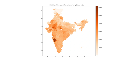
| Model Predicted Raw Votes for National Democratic Alliance (NDA) |
 |
|---|
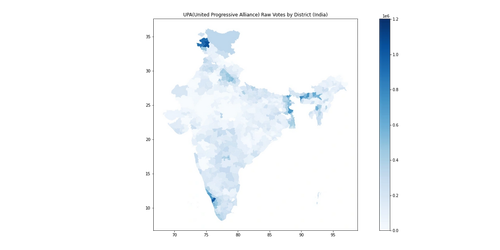
| Model Predicted Raw Votes for United Progressive Alliance (UPA) |
- In the state of Uttar Pradesh and eastern districts along West Bengal, there were strong major third party performances and the UPA was non existent, so the results may seem lopsided.
- In the western portions, the legend may undertone the margin but those regions are highly bipolar and thus a 20-25% victory margin is deceivingly low due to the normalisation of the legend.
 |
|---|
| Higher Red -> Higher NDA |
| Higher Blue -> Higher UPA |
 |
|---|
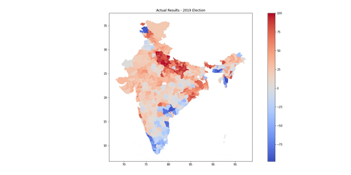
| Higher Red -> Higher NDA |
| Higher Blue -> Higher UPA |
Model Analysis
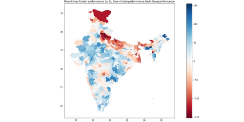 |
|---|
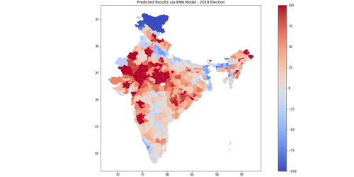
| Red -> NDA Over-performance/UPA Underperformance |
| Blue -> UPA Over-performance/NDA Underperformance |
The above map shows the relative comparison between the actual 2019 election results and prediction ML model. The results are quite interesting -
The map above shows how the districts would vote purely on demographics and alliances’ relative performances. The areas that are redder are those where the NDA performed better in the 2019 election than they do in the model. Hence they overperform the demographics. The areas that are bluer are where the UPA performed better/NDA performed worse than they do in the model. Thus UPA overperforms while NDA underperforms the demograhics of the district.
- Blue areas are those that the NDA alliance underperformed in the model as compared to the actual election. Thus, this translates to stronger performance given the demographics of the area for the NDA. Essentially the NDA does better with voters in blue shaded areas than they do nationally on aggregate.
- Red areas are those that the NDA alliance over-performed in the model as compared to the actual election. Thus, this translates to weaker performance in the 2019 election given the demographics of the area for the NDA. Essentially the NDA does worse with voters in red shaded areas than they do nationally on aggregate.
Spatial Trends
- Areas with high Muslim population are areas where the NDA tends to over-perform, likely due to strong third parties but more predominantly due to religious polarisation such that all religious groups vote more lopsidedly in highly Muslim areas, especially in western Uttar Pradesh, eastern Bihar and peninsular West Bengal.
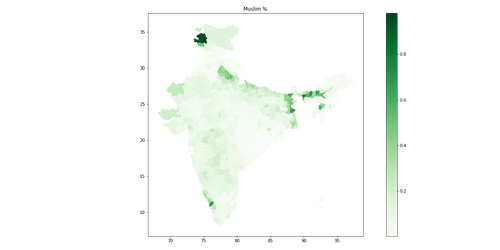 |
|---|
| Muslim % by District |
- The NDA also over-performs in the tribal belt in Western India across the Gujarat/Madhya Pradesh border.
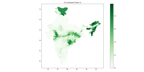 |
|---|
| Tribal % by District |
Model Shortcomings & Future Scope
- Things like better model selection and parameter optimisation can ideally match demographics much better ot voting patterns.
- Using multi party prediction tools can help achieve lesser deviance and allow for more accurate spatial analysis, since these third parties contribute to ~15-20% of the national vote.
- As always, some places just love to defy trends and always lie as outliers.